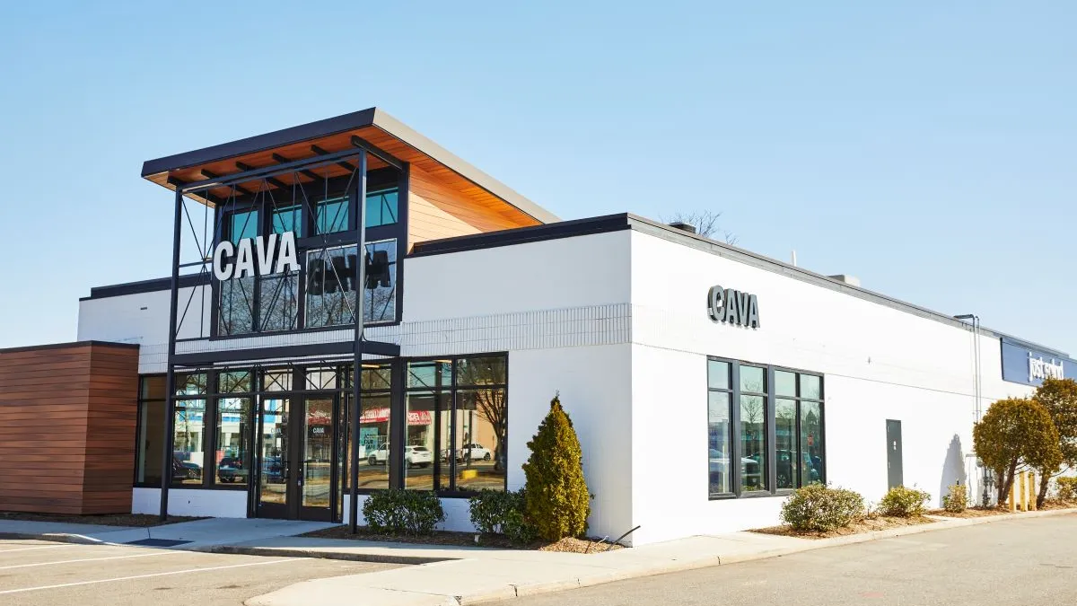
Cava is taking a bold step that at first blush may not sound very risky: It wants to make its dining rooms more inviting to customers.
As part of its “Project Soul” campaign, the chain wants to deepen customer loyalty by, among other changes, adding softer seating and a new color palette to its interiors — a move rooted in the fact that 64% of orders come via dine-in traffic, said CEO Brett Schulman during an earnings call in February.
That goal is not typical among quick service and fast casual restaurants, which often aim to get customers in and out quickly, since their customers don’t typically purchase additional items after their initial order, experts say.
Encouraging lingering diners runs counter-intuitive to what a limited-service venue is and the check averages that they typically garner, said Rick Camac, executive director of industry relations at the Institute of Culinary Education.
Generally, limited-service restaurants should “avoid creating a space that encourages diners to linger when there’s demand for the table,” Camac said.
But Cava, which serves guests custom Mediterranean salad bowls and pitas at stations along a front counter — a prep structure similar to Chipotle’s — wants to develop personal relationships with guests and create a “cohesive physical and digital journey” for them, said Schulman.
Should other QSRs follow Cava’s example? There are many ways that QSRs and fast casual restaurants could improve the customer experience for their guests at their stores, including finding the right lighting, seating, music, volume, furnishings and ceiling height. But there are also several steps QSRs should take before deciding whether to make such changes or figuring out what changes to make.
Experts say these five steps will help QSRs improve dining room ambiance.
Do your research
QSRs like Cava need to do their homework before designing their dining rooms, said Camac.
Restaurants should conduct a data analysis of the average check size at the establishment compared to table turns to figure out whether it would be wise to encourage customers to come inside, said Camac.
Technology can aid a restaurant's dining room design by providing management a greater understanding of who their customers are and how they can meet their needs, said Nickel Lowman, head of marketing and business design at SCA Design. Customer data can be collected through point-of-sales systems, loyalty rewards programs or when customers connect to Wi-Fi, she said.
If a restaurant is frequented by business professionals, for instance, dining rooms would need less seating, Lowman said. Meanwhile, if more families dine at the restaurant, they may occupy tables longer and require high chairs.
“Understanding who your clientele is key to understanding how to design your facility,” she said.
Consider the brand and cuisine
Fast casual restaurants need to think about the kind of image they would like to portray to customers wanting to dine at their restaurants, said Lowman.
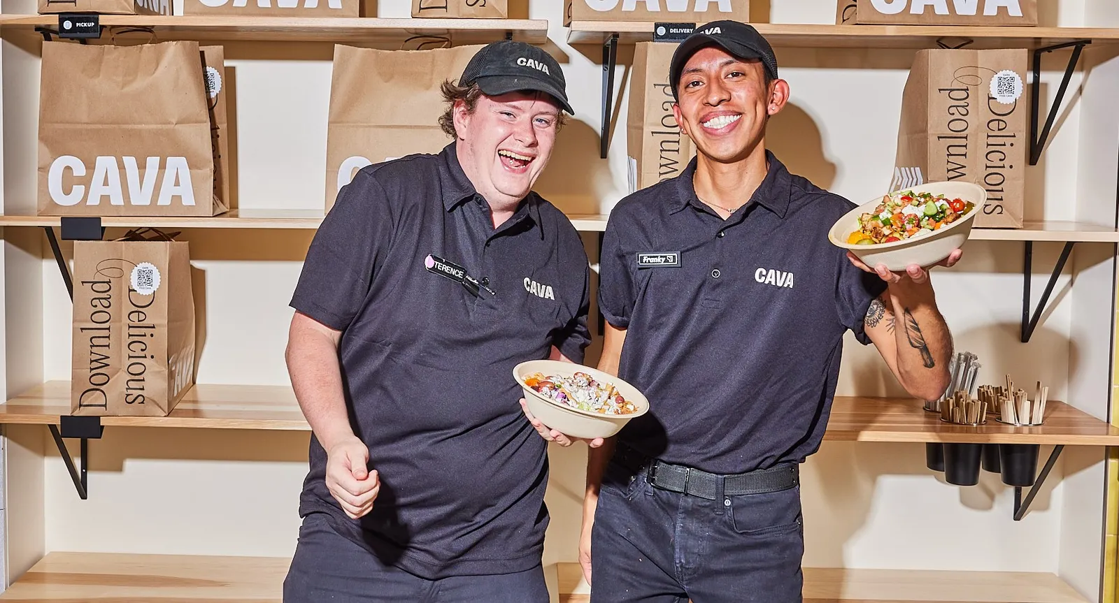
Looking at photos of interiors at Cava restaurants recently, Lowman said she was confused by what their brand really was. It’s sleek and modern, but employees also wore standard black T-shirts and hats — nothing that indicates they are different or stand out, she said. Chipotle’s workers wear similar attire.
“I don’t know if that’s the vibe they’re going for, but there’s nothing in their location that tells me the type of cuisine,” said Lowman. “There was no kind of indicator of anything Mediterranean. It was very vanilla.”
Customers that are dining in-house are looking for “an experience that is going to be memorable,” and QSRs should incorporate interiors that set it apart from its competitors, said Lowman.
Cava could add different Mediterranean flairs to its light fixtures, or perhaps add stained glass, a simple window treatment, textured wallpapers, fabrics, or music that’s relative to the location of the cuisine, she said. Those aspects tied together will create that distinctive experience.
On the other hand, emerging Mediterranean chain Mezah has colorful seating, tiling and lights that match the colorful cuisine it offers.
“Like the food on your plate, you want it to look appealing. You want the environment to match that appeal of what you’re going for,” said Lowman.
Seating placement
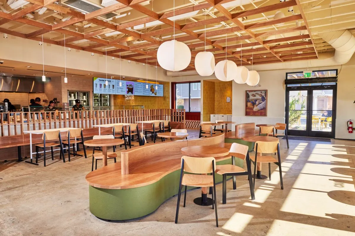
Fast casual and QSRs wanting to make their dining rooms more appealing to guests should anchor their seating against a wall, a structural column or the wall that separates the dining area from the queue, said Stephani Robson, a restaurant consultant and emeritus faculty member at Cornell University with expertise on the psychology of restaurant design.
“We like to be up against things when we dine because it makes us feel more secure,” said Robson.
There also needs to be plenty of space between seats, said Camac. He suggested limited-service restaurants leave at least 11-to-13 square feet between each seat, factoring tables and walkways into those measurements — or 15 square feet for even more comfort.
Those seats should have some cushion and be comfortable enough so that diners don’t leave due to discomfort, Camac added, estimating chairs in the $100 price range “should do the trick there.”
QSRs like Cava or Shake Shack that want people to dine in could create the appearance that there’s a lot of activity going on inside the restaurant by making the seating visible from the street, Robson added. Adding seats in spots where people can watch the counter where the food they ordered will arrive, could make dining more enticing for customers, she said.
“A lot of it really boils down to understanding people’s behavior and what’s motivating it,” said Robson.
The right sound
The amount of sound in the dining room can also factor into a patron’s comfort.
While chairs that are not bolted to the ground bring an upscale feeling to a restaurant, if they are not selected carefully or the dining room doesn’t have the right floor finish, they can cause a lot of noise, Robson said.
Cava dining rooms, for instance, have a lot of hard finishes, and metal chairs can be pulled out, which can generate a lot of noise, said Robson.
The type of music being played, the volume of the music, modification of the sound systems, and the placement of the speakers can also factor into that noise level, said Robson. Sounds like kitchen noises, people getting beverages, customers waiting in line are all amplified if there are a lot of hard finishes throughout the restaurant.
Restaurants should aim to keep the noise in the dining room at around 70 decibels — a “sweet spot” in which it's not so quiet that a guest will feel they are being overheard during a conversation, but not so loud they would have to raise their voices, she said.
Providing comfort
Restaurants can carry a higher-end image by avoiding laminate finishes, not bolting chairs to the floor and not installing televisions throughout the dining room, which could lead to guests paying a little more, Robson said. Warm lighting is also preferable to fluorescent or less expensive lighting, she added.
When the lighting is too bright, it can make the room feel like a hospital or a cafeteria, Camac added.
“Warmer lighting is definitely preferable. Most people will be attracted to it. Everybody looks better, [and the] food looks better,” said Robson.
The dining area’s colors can also factor into the ambiance, said Camac. Depending on the brand, warm tones typically evoke energy and are said to increase appetite — with red and orange often considered appropriate for fast casual meals — while cooler tones provide calmness, he said.
So can the dining area’s temperature, which should never be too warm, said Camac, suggesting it should be kept at 72 degrees or cooler.
Lowman added that restaurants could add doors that fold up into a patio, allowing for open seating during certain times of the year — while avoiding having customers sit in 100 degree weather.
Restaurants can also play with the height of their ceilings, said Robson. Depending on the size of the space, there are certain ceiling height ratios that make people feel comfortable, she said.
If ceilings are too low, the space can feel like “a parking garage,” she said. If it’s too high, “it feels like the bottom of an elevator shaft,” she added.


